Aurora
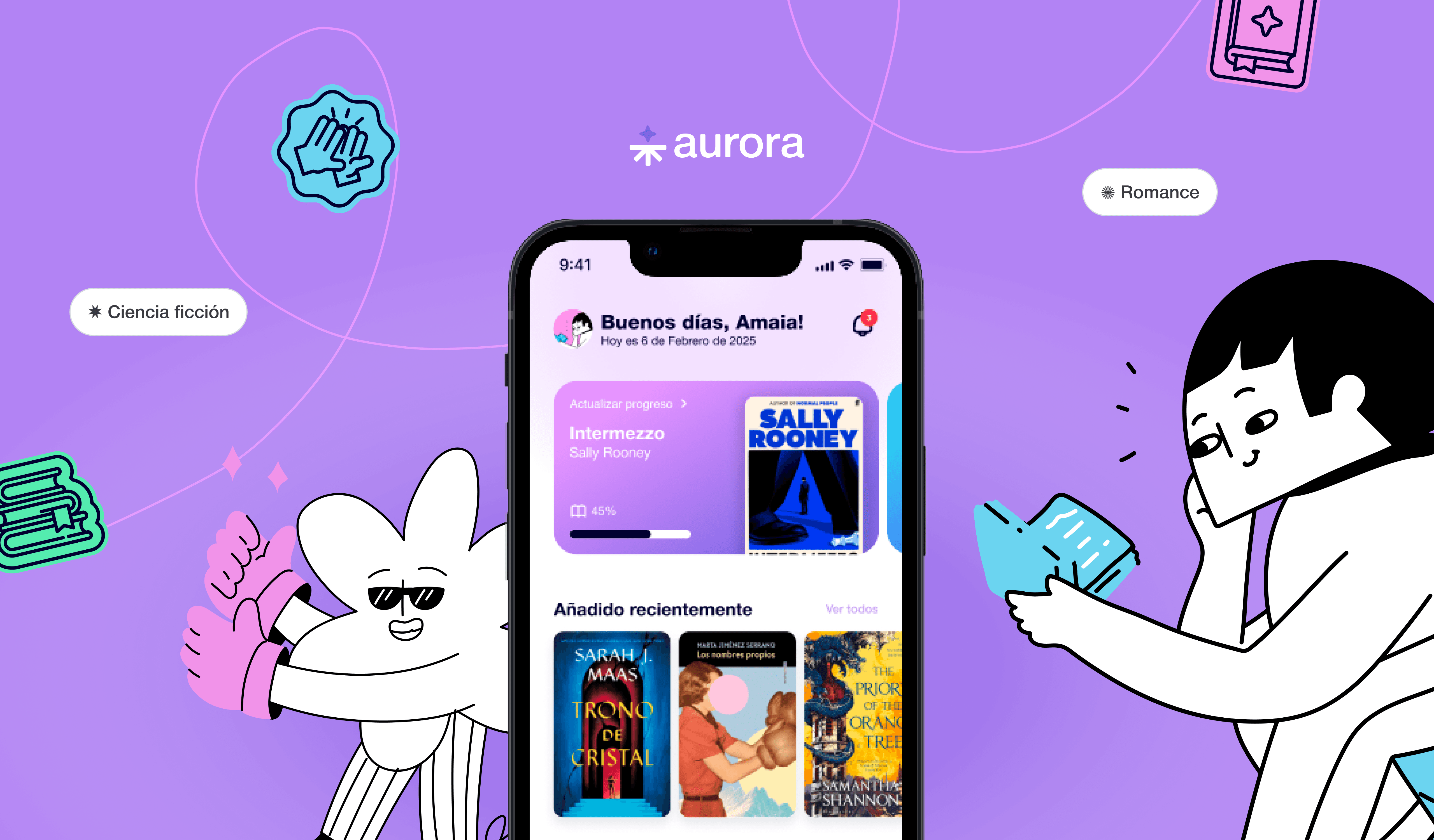
A social app designed for readers
Fields
UX Research
Brand Design
UX Design
Interface Design
Prototyping
Tools
Figma
Adobe Creative Cloud
Year
2025
The brief
Problem Statement
Existing reading platforms allow users to log books, but they suffer from outdated UX, dead-end recommendation algorithms, and a complete lack of motivation to keep going.
Solution
Aurora fixes that. A multi-platform reading space that blends clean tracking, human-driven social discovery, and lightweight gamification to make reading a habit again.


Research
To figure out why people abandon books halfway through, I surveyed actual readers and poked around competitor apps.
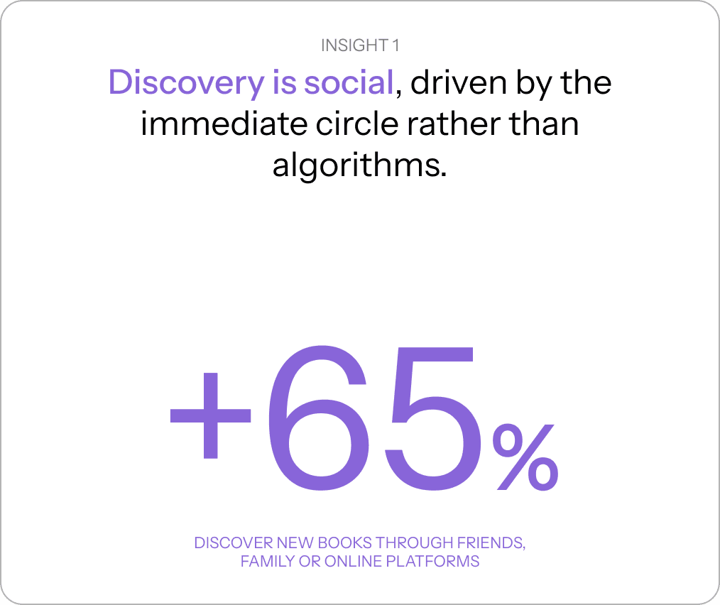
Turns out, people love reading, they just hate clunky, outdated interfaces.


KEY FEATURES
From sticky notes to core features
Research findings were transformed into four core product features.
/ 01
Personal library
Your digital bookshelf for every stage of your reading life, complete with a much-needed graveyard for abandoned books.
/ 02
Social Discovery
Because algorithms don't know your taste as well as your book-nerd friends do. Real recommendations from real humans.
/ 03
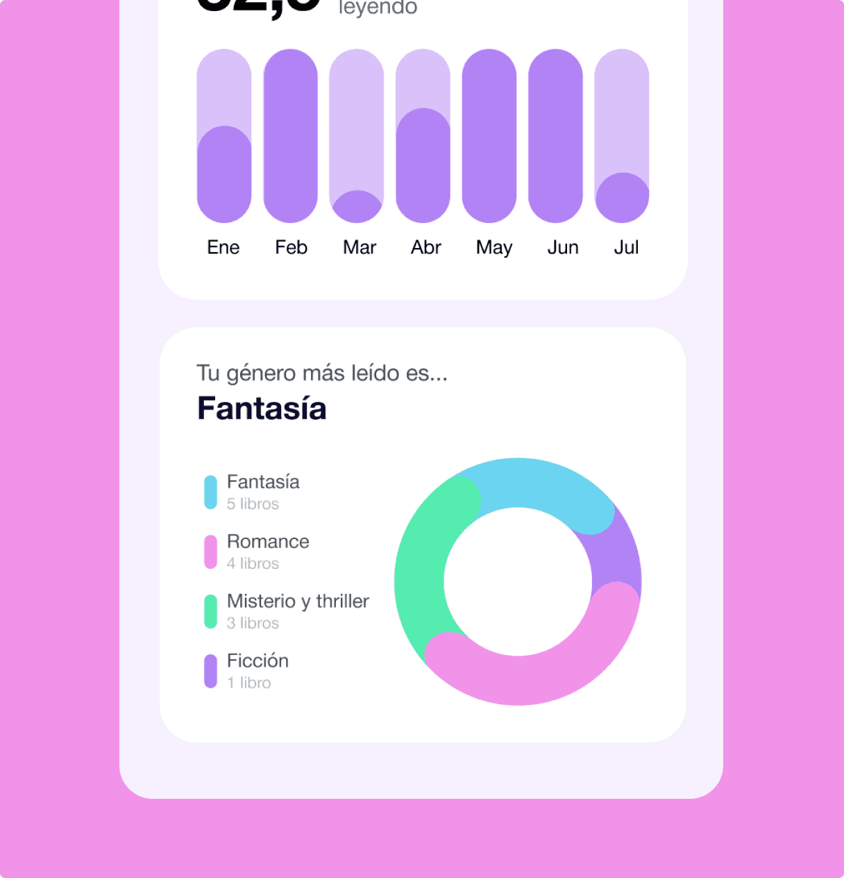
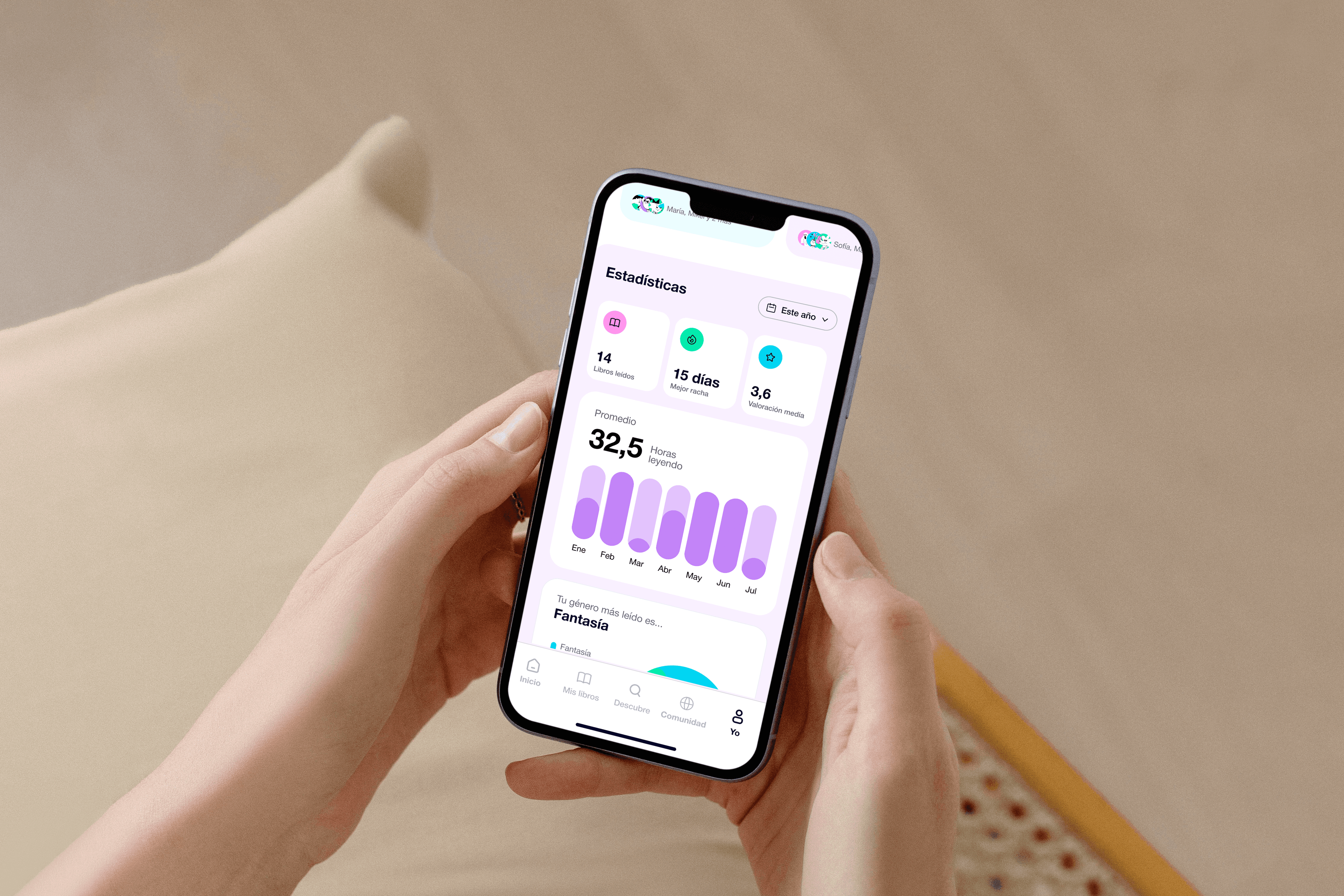
Reading Insights
Detailed breakdowns of your reading habits, annual goals, time spent turning pages, and your top genres visualized so you can watch your literary journey unfold.
/ 04
Gamification System
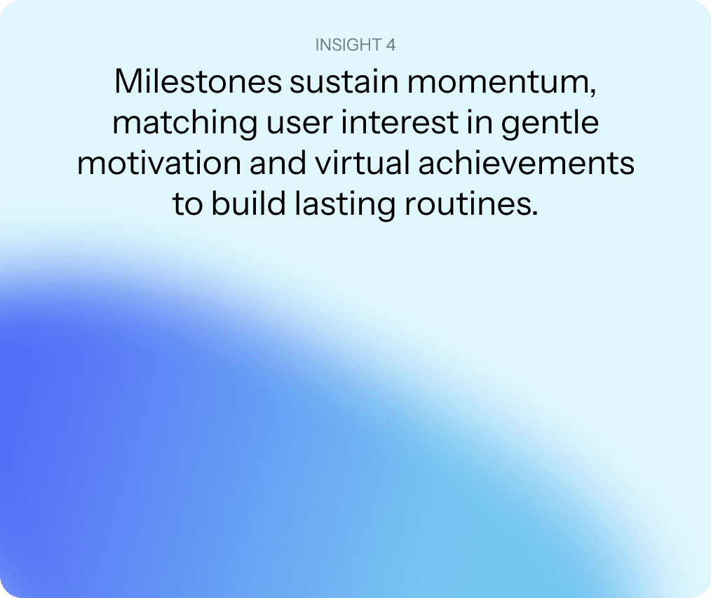
Badges, streaks, and milestones designed to trick your brain into reading just one more chapter before bed.
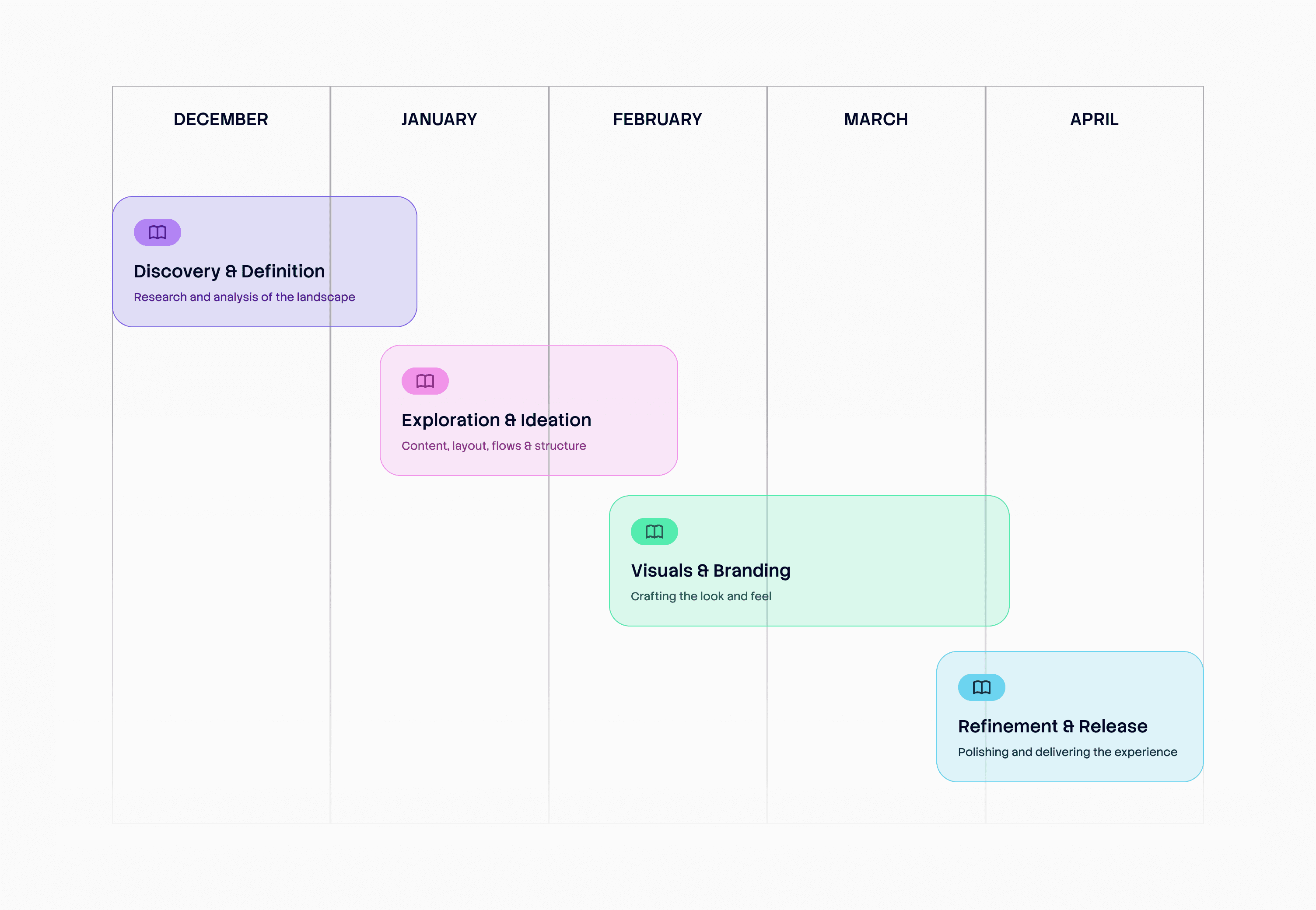
The process
From chaos to structure
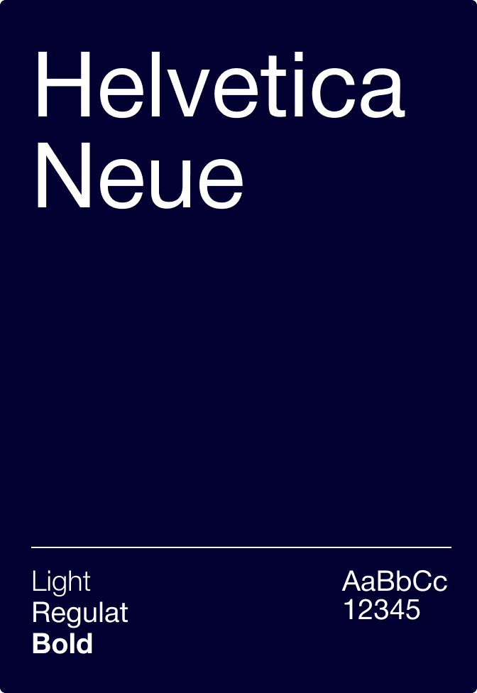
Translating raw insights into a solid foundation—mapping out the architecture, defining the visual identity, and structuring a flow where users can finally organize, discover, and chat about books without wanting to throw their phone across the room.



Screens
From Wireframes to Final UI
+70 screens were designed for the platform. Here are some of the key ones.
Onboarding
Tailored to your literary soul
Quick preferences setup so Aurora gets to know your taste right away, serving up recommendations you’ll actually want to read instead of generic bestsellers.
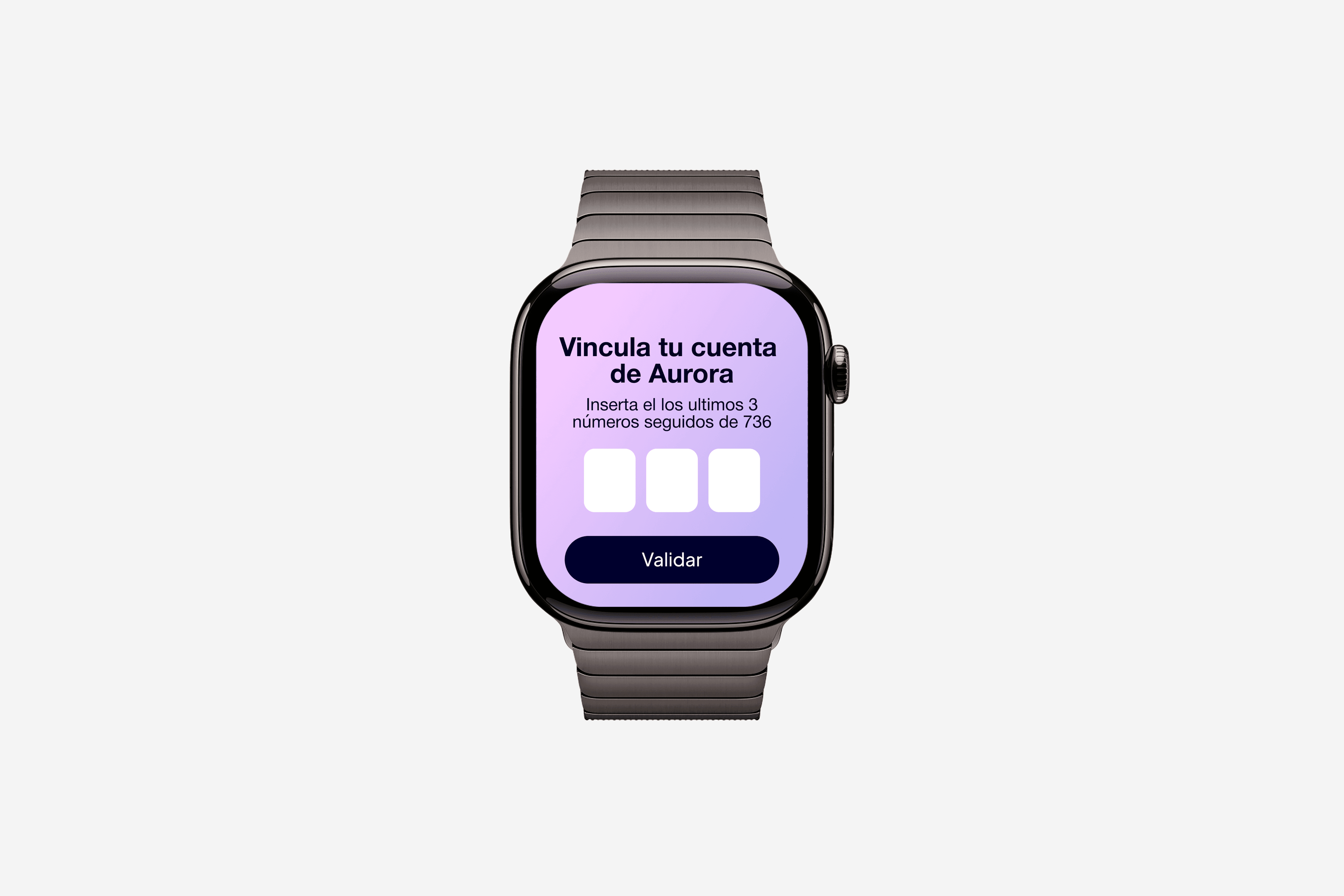
Ecosystem Sync
Your reading life, everywhere
Hook up Goodreads to import your history instantly, sync your Kindle, and link your smartwatch so your progress updates automatically while you read without extra manual data entry.


Key takeaways
Talk to real users first
Skipping generic feature lists and grounding the roadmap in actual reader frustrations kept the product lean, focused, and genuinely fun to use instead of just another bloated app.
Design systems save sanity
Building a solid foundation early meant I didn't spend hours wrestling with component states while pushing for pixel perfection across +70 screens.
Context is everything
Designing for mobile, web, and smartwatches taught me that true cross-platform design isn't about shrinking layouts, it's about designing friction-free moments for whatever device is in the user's hand (or wrist) at that second.
Aurora
A social app designed for readers
Fields
UX Research
Brand Design
UX Design
Interface Design
Prototyping
Tools
Figma
Adobe Creative Cloud
Year
2025
The brief
Problem Statement
Existing reading platforms allow users to log books, but they suffer from outdated UX, dead-end recommendation algorithms, and a complete lack of motivation to keep going.
Solution
Aurora fixes that. A multi-platform reading space that blends clean tracking, human-driven social discovery, and lightweight gamification to make reading a habit again.
Research
To figure out why people abandon books halfway through, I surveyed actual readers and poked around competitor apps.
Turns out, people love reading, they just hate clunky, outdated interfaces.
KEY FEATURES
From sticky notes to core features
Research findings were transformed into four core product features.
/ 01
Personal library
Your digital bookshelf for every stage of your reading life, complete with a much-needed graveyard for abandoned books.
/ 02
Social Discovery
Because algorithms don't know your taste as well as your book-nerd friends do. Real recommendations from real humans.
/ 03
Reading Insights
Detailed breakdowns of your reading habits, annual goals, time spent turning pages, and your top genres visualized so you can watch your literary journey unfold.
/ 04
Gamification System
Badges, streaks, and milestones designed to trick your brain into reading just one more chapter before bed.
The process
From chaos to structure
Translating raw insights into a solid foundation—mapping out the architecture, defining the visual identity, and structuring a flow where users can finally organize, discover, and chat about books without wanting to throw their phone across the room.
Screens
From Wireframes to Final UI
+70 screens were designed for the platform. Here are some of the key ones.
Onboarding
Tailored to your
literary soul
Quick preferences setup so Aurora gets to know your taste right away, serving up recommendations you’ll actually want to read instead of generic bestsellers.
Ecosystem Sync
Your reading life, everywhere
Hook up Goodreads to import your history instantly, sync your Kindle, and link your smartwatch so your progress updates automatically while you read without extra manual data entry.
Key takeaways
Talk to real users first
Skipping generic feature lists and grounding the roadmap in actual reader frustrations kept the product lean, focused, and genuinely fun to use instead of just another bloated app.
Design systems save sanity
Building a solid foundation early meant I didn't spend hours wrestling with component states while pushing for pixel perfection across +70 screens.
Context is everything
Designing for mobile, web, and smartwatches taught me that true cross-platform design isn't about shrinking layouts, it's about designing friction-free moments for whatever device is in the user's hand (or wrist) at that second.
Aurora
A social app designed for readers
Fields
UX Research
Brand Design
UX Design
Interface Design
Prototyping
Tools
Figma
Adobe Creative Cloud
Year
2025
The brief
Problem Statement
Existing reading platforms allow users to log books, but they suffer from outdated UX, dead-end recommendation algorithms, and a complete lack of motivation to keep going.
Solution
Aurora fixes that. A multi-platform reading space that blends clean tracking, human-driven social discovery, and lightweight gamification to make reading a habit again.
Research
To figure out why people abandon books halfway through, I surveyed actual readers and poked around competitor apps.
Turns out, people love reading, they just hate clunky, outdated interfaces.
KEY FEATURES
From sticky notes to
core features
Research findings were transformed into four core product features.
/ 01
Personal library
Your digital bookshelf for every stage of your reading life, complete with a much-needed graveyard for abandoned books.
/ 02
Social Discovery
Because algorithms don't know your taste as well as your book-nerd friends do. Real recommendations from real humans.
/ 03
Reading Insights
Detailed breakdowns of your reading habits, annual goals, time spent turning pages, and your top genres visualized so you can watch your literary journey unfold.
/ 04
Gamification System
Badges, streaks, and milestones designed to trick your brain into reading just one more chapter before bed.
The process
From chaos to structure
Translating raw insights into a solid foundation—mapping out the architecture, defining the visual identity, and structuring a flow where users can finally organize, discover, and chat about books without wanting to throw their phone across the room.
Screens
From Wireframes to Final UI
+70 screens were designed for the platform. Here are some of the key ones.
Onboarding
Tailored to your literary soul
Quick preferences setup so Aurora gets to know your taste right away, serving up recommendations you’ll actually want to read instead of generic bestsellers.
Ecosystem Sync
Your reading life, everywhere
Hook up Goodreads to import your history instantly, sync your Kindle, and link your smartwatch so your progress updates automatically while you read without extra manual data entry.
Key takeaways
Talk to real users first
Skipping generic feature lists and grounding the roadmap in actual reader frustrations kept the product lean, focused, and genuinely fun to use instead of just another bloated app.
Design systems save sanity
Building a solid foundation early meant I didn't spend hours wrestling with component states while pushing for pixel perfection across +70 screens.
Context is everything
Designing for mobile, web, and smartwatches taught me that true cross-platform design isn't about shrinking layouts, it's about designing friction-free moments for whatever device is in the user's hand (or wrist) at that second.